Stats Box
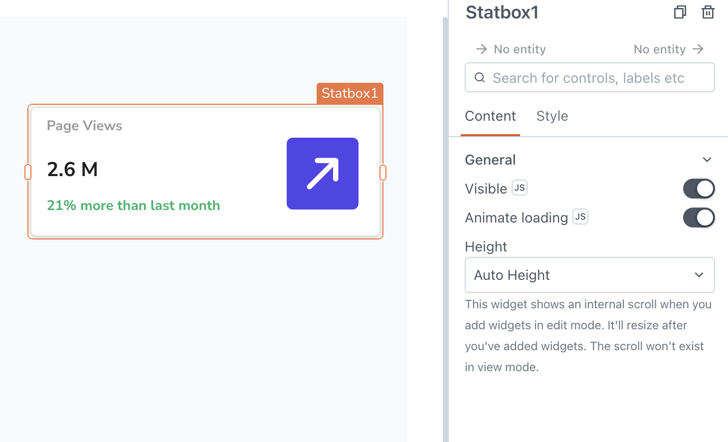
This page provides information on using the Stats Box widget, a container that presents statistics with customizable layout options. The Stats Box widget comes pre-built with a default layout, including three Text widgets and one Icon widget.

Content properties
These properties are customizable options present in the property pane of the widget, allowing users to modify the widget according to their preferences.
General
Visible boolean
Controls the visibility of the widget. If you turn off this property, the widget would not be visible in View Mode. Additionally, you can use JavaScript by clicking on JS next to the Visible property to conditionally control the widget's visibility.
For example, if you want to make the widget visible only when the user selects Yes from a Select widget, you can use the following JavaScript expression:
{{Select1.selectedOptionValue === "Yes"}}
Animate Loading boolean
This property controls whether the widget is displayed with a loading animation. When enabled, the widget shows a skeletal animation during the loading process. Additionally, you can control it through JavaScript by clicking on the JS next to the property.
Height string
This property determines how the widget's height adjusts to changes in its content. There are three available options:
- Fixed: Maintains a constant height for the widget, allowing you to adjust it by dragging or using the resize handle.
- Auto Height: The widget's height adjusts dynamically in response to changes in its content.
- Auto Height with limits: Same as Auto height, with a configurable option to set the minimum and maximum number of rows the widget can occupy.
Style properties
Style properties allow you to change the look and feel of the widget.
Color
Background color string
Specifies the background color of the Stats Box container.
Border color string
Specifies the color of the widget's border. You can define the color using an HTML color name, HEX, RGB, or RGBA value.
Border and shadow
Border width number
Sets the value for border width.
Border radius string
Applies rounded corners to the outer edge of the widget. If JavaScript is enabled, you can specify valid CSS border-radius to adjust the radius of the corners.
Box Shadow string
This property adds a drop shadow effect to the frame of the widget. If JavaScript is enabled, you can specify valid CSS box-shadow values to customize the appearance of the shadow.
Reference properties
These properties are not available in the property pane, but can be accessed using the dot operator in other widgets or JavaScript functions. For instance, to get the visibility status, you can use Statsbox1.isVisible.
As the Stats Box widget works as a container, you can access the values of other widgets using their respective reference properties. For example, to access the text value of a Text widget, you can use Text1.text.
isVisible boolean
The isVisible property indicates the visibility state of a widget, with true indicating it is visible and false indicating it is hidden.
Example:
{{Statsbox1.isVisible}}
Methods
Widget property setters enable you to modify the values of widget properties at runtime, eliminating the need to manually update properties in the editor.
These methods are asynchronous, and you can use the .then() block to ensure execution and sequencing of subsequent lines of code in Appsmith.
setVisibility boolean
Sets the visibility of the widget.
Example:
Statbox1.setVisibility(true)
To perform sequential actions, use the .then() block for execution.
Statbox1.setVisibility(true).then(() => {
  // code to be executed after visibility is set
})